These are the charts from the midseason analysis that didn’t make it into the Commissioner’s Notes in the 2026 Week 7 Recap. Everything here covers weeks 1–7.
How to read these
“Points” always means a team’s game margin, the same as scoring. A few measures show up throughout:
- Times played: how many lineup slots you started that team in.
- Points when active: the team’s total margin in the games you started it.
- Net points, owned: the team’s total margin in every game it played while on your roster, started or not.
- Net points, season: the team’s total margin in every game it has played this season, no matter who owned it.
- Pick edge: points when active minus (times played × the team’s season average margin). Positive means you started that team in its better-than-usual weeks.
In the team charts, each dot is one team on one player’s roster. Blue means drafted, orange means picked up as a free agent. A team that was drafted, dropped, and picked up again shows up twice, once for each stint. Integer counts like times played are jittered slightly so dots that would overlap stay visible.
Did you start the right teams?
Net points owned vs. points when active
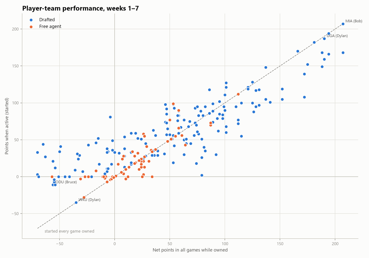
The x-axis is everything a team did while you owned it; the y-axis is what you actually banked from it. The dashed line is “started it in every game I owned it.” A dot on the line means you never benched it (Bob’s Miami, top right, is the cleanest example: 207 points owned, 207 banked). A dot below the line means you left points on the bench, so the further down and right, the more a good team sat while it was winning. A dot above the line means the games you benched it were the bad ones: the team was mediocre or even negative overall while you had it, but you played it in its good weeks.
Free agents (orange) cluster close to the line near zero. That’s expected: they’re usually picked up for a specific week, started, and then either dropped or not leaned on much.
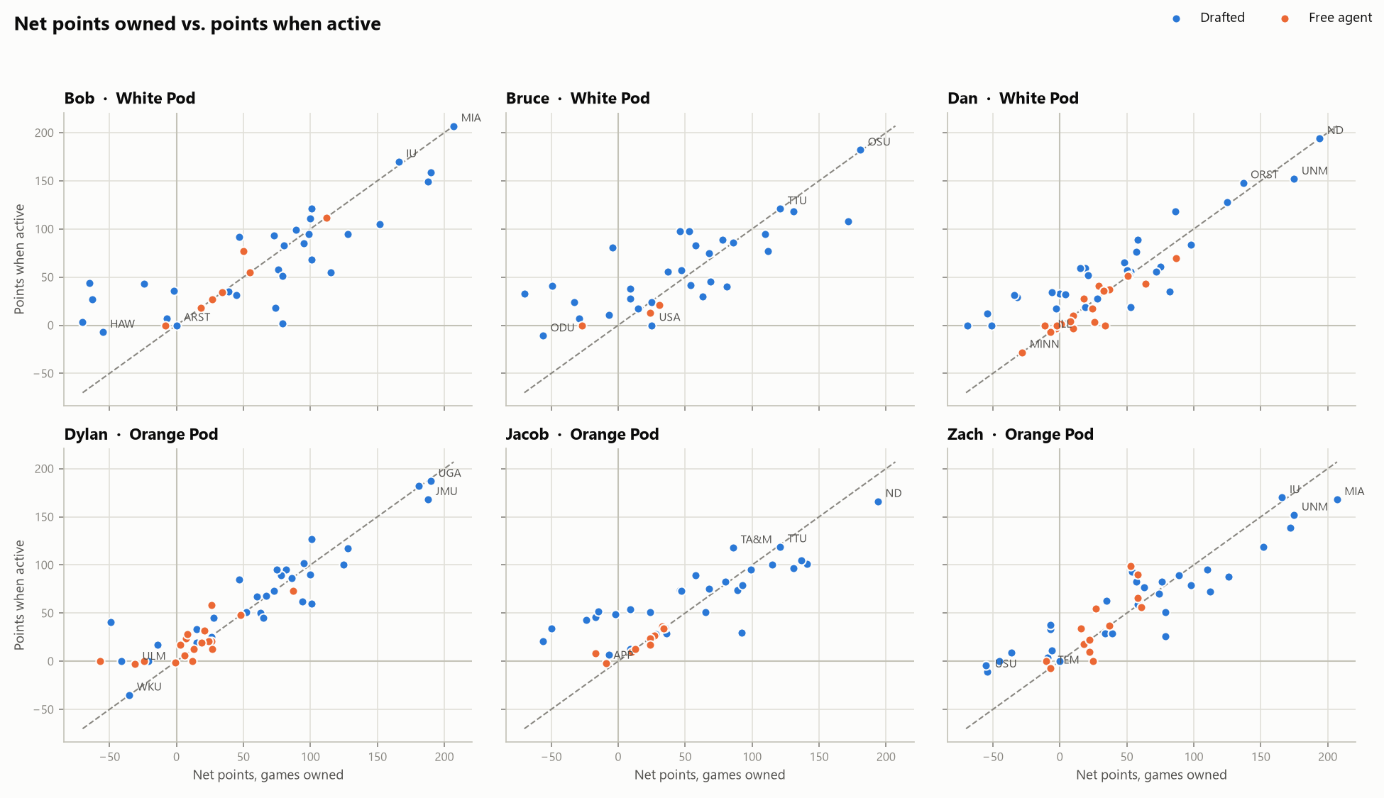
The same chart split by player, on shared axes so you can compare panels directly. Labels mark each player’s most notable teams.
Getting value out of bad teams
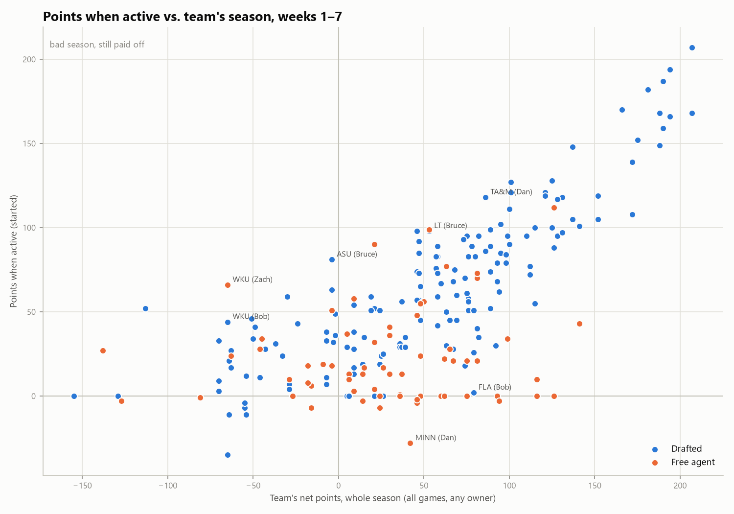
This swaps the x-axis for the team’s whole season, regardless of who owned it. The upper-left quadrant (“bad season, still paid off”) is the interesting one: teams that are underwater for the year, but returned positive points in the weeks someone started them. Labels mark the biggest pick edges. Bruce got 81 points out of Arizona State (−4 on the season) in 2 starts, and Zach got 66 out of a Western Kentucky team that’s −65 on the season. At the other end, dots far below the trend, like Dan’s Minnesota, are decent teams started in their worst week.
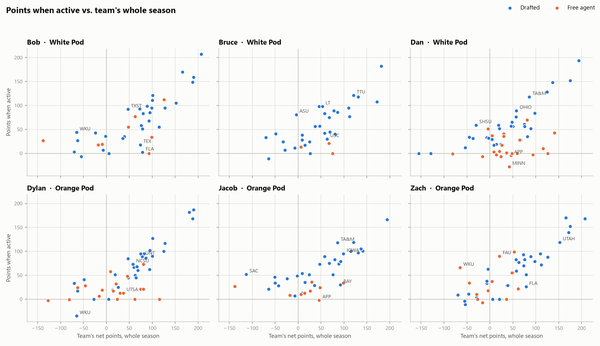
By player, with labels on each player’s biggest and smallest pick edges. Across all of us, starting teams that are net-negative for the season has produced about 226 points per player so far; Jacob has gotten the most out of them (315 points) and Dylan the least (129).
Usage
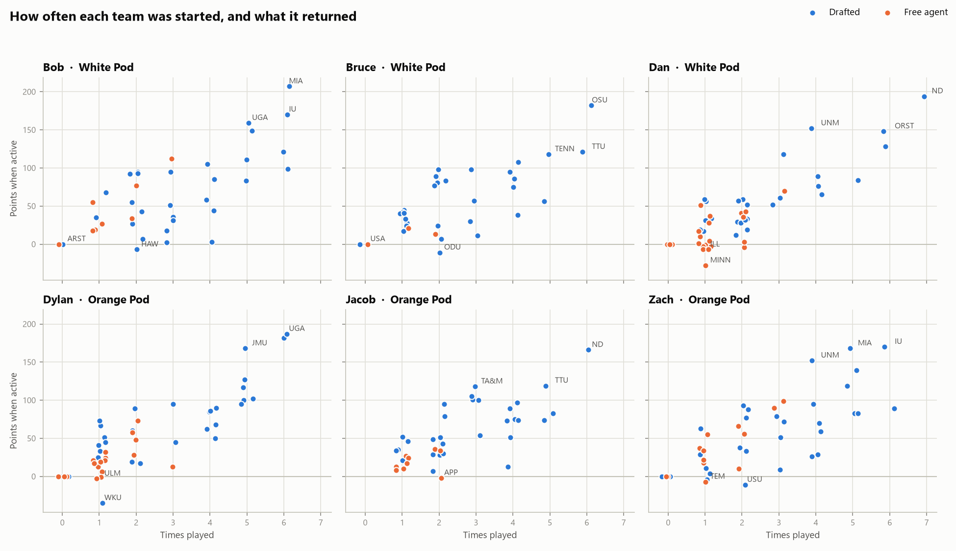
How often each team was started, and what it returned. The top-right dots are your workhorses: Dan has started Notre Dame in all 7 weeks for 194 points. Dots at zero on the x-axis are teams that have never been started.
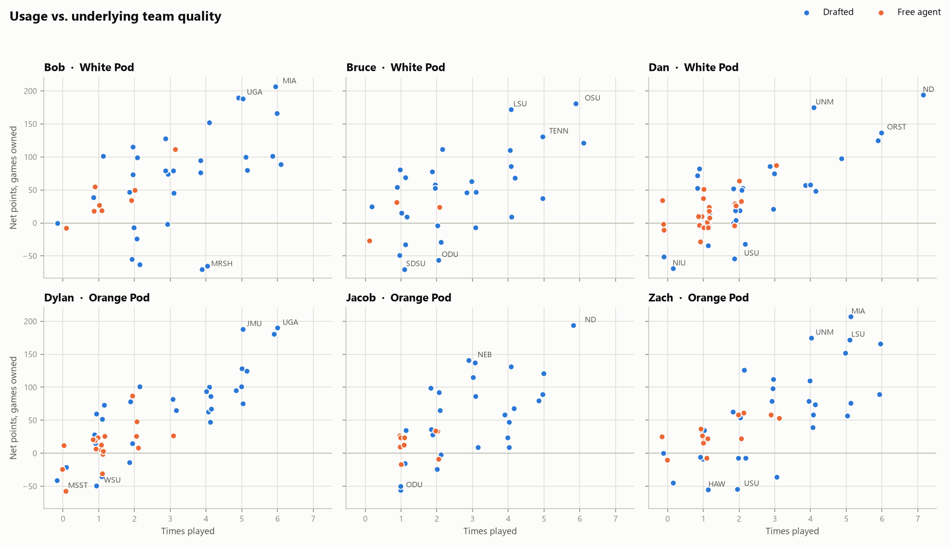
The same x-axis, but the y-axis is how good the team actually was while you owned it, started or not. This asks whether your best teams were your most-used ones. A dot high up but far left is a good team that didn’t get many starts, like Bruce’s LSU (+172 while owned, started 4 times for 108). A dot low but further right is a team you kept trusting that didn’t deliver, like Bob’s Marshall (4 starts, 3 points total, −70 while owned). Keep in mind times played is capped by byes and by the lineup itself: only one team per conference slot plus a handful of flexes, so two good teams from the same conference compete for starts.
Who plays like whom?
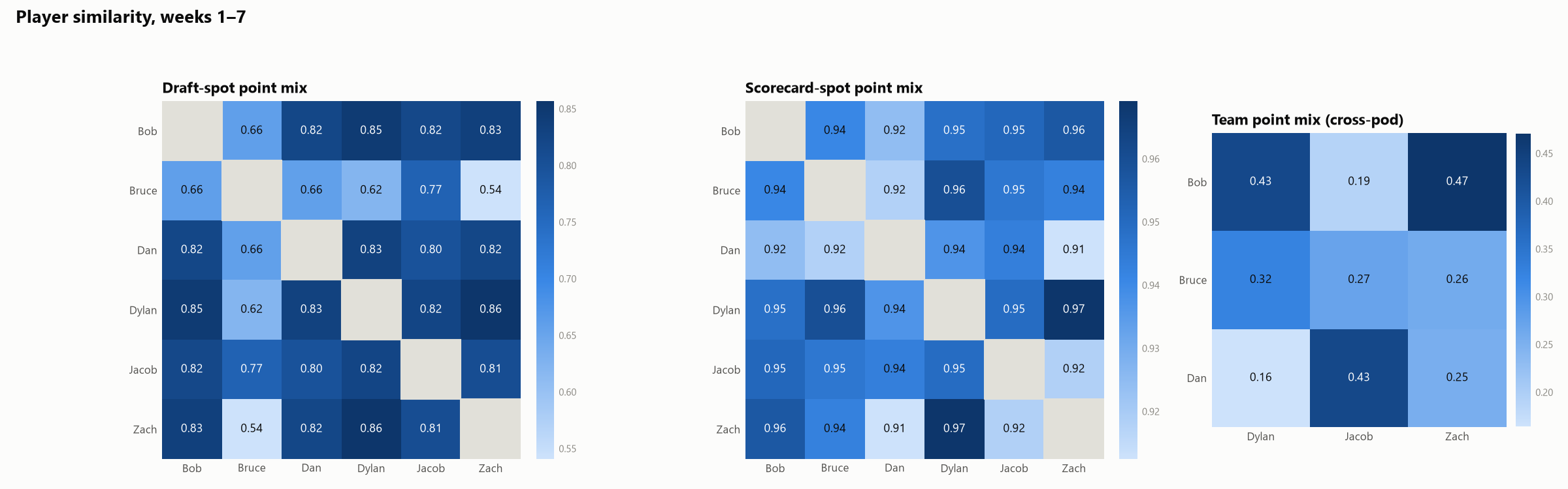
Each panel compares every pair of players by the mix of where their points come from, using cosine similarity: 1.00 means an identical mix, 0 means nothing in common. Total points don’t matter, only the proportions. Darker is more similar, and each panel has its own color scale because the three measures sit in very different ranges.
- Draft-spot point mix: share of points from each draft round, plus one bucket for all free agents. Dylan and Zach are the most alike (0.86). Bruce stands apart from everyone (0.54–0.77), mostly because he’s barely touched free agency: under 2% of his points have come from pickups, against an average of about 12%.
- Scorecard-spot point mix: share of points from each lineup slot (each conference, P4 flex, G6 flex, wildcard). Everyone fills the same 16 slots every week, so these all land at 0.91–0.97 and the differences are small. Dylan and Zach are again the closest pair (0.97).
- Team point mix: how much of each player’s points came from the same teams. This is cross-pod only, since two players in the same pod can’t roster the same team. Bob and Zach are the most alike (0.47): they share 16 teams, which supply 41–46% of each one’s points. Dan and Dylan share the most teams of any pair (17) but are the least alike (0.16), because they get their points from different ones.
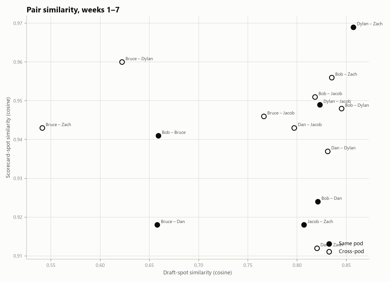
The first two panels above, combined into one chart. Each dot is a pair of players; filled dots are same-pod pairs and hollow dots are cross-pod. Pairs in the upper right drew their points from the same draft rounds and the same lineup slots, and Dylan–Zach is alone in that corner. Every pair involving Bruce sits on the left side, for the free-agency reason above.
What each remaining PVP game is worth
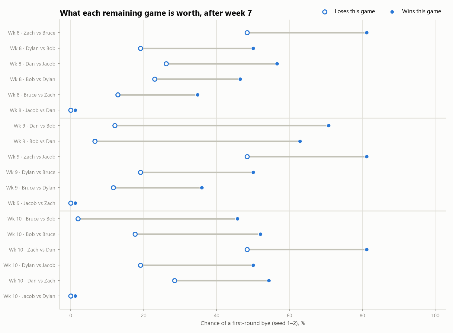
Seeds 1 and 2 get a first-round bye. Seed 1 is the best record overall, and seed 2 is the best record from the other pod. For every remaining regular-season PVP game, this shows the player’s chance of a bye if they win (filled dot) and if they lose (hollow dot), with every other game still open and every game treated as a coin flip. The longer the bar, the more that one game matters.
The biggest game left is Dan vs. Bob in week 9. A win takes Dan to about a 71% bye chance, and a loss drops him to 12%. Bob’s version of the same game is 63% vs. 7%. Zach’s bye chance is about 81% with a win and 48% with a loss in each of his three remaining games, and Dylan’s is about 50% vs. 19%. Jacob’s bars are nearly invisible: a bye is essentially out of reach (about 1% at best), so his remaining games are about seeding, not the bye.